Welcome back, my intrepid design enthusiasts, to the next thrilling chapter of our e-book, “Beginning with UX: A Practical Approach.” Today, in Chapter 5 titled “Principles of Usable Design: What Makes a Design Usable,” we’re about to embark on a journey into the core of usable design principles. If you thought “Tools of the Trade: A Look at Popular UX Design Tools and Software” was a riveting read, just wait until we dive into the usability principle waters where design not just survives but thrives.
Usable Design: The What and The Why
What is usable design? It’s the heartbeat of UX, the very essence that makes a digital product not just usable but inherently intuitive and delightful. Usable design goes beyond aesthetics; it’s about creating interfaces that users can navigate effortlessly, where every element serves a purpose, and where frustration is as rare as a unicorn in a cityscape.
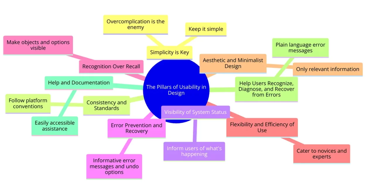
The Pillars of Usability in Design
Usability principles in design are not just guidelines; they’re the commandments that separate the divine from the mundane. But what is a usability principle, you ask? Let’s break it down with insights inspired by renowned sources like the usabilitybok.org, lyssna.com, the Nielsen Norman Group, Aela School, and Stanford’s improvement resources. These principles are the bread and butter of creating designs that speak the user’s language.
- Simplicity is Key: Keep it simple! The simpler the design, the easier it is for users to accomplish their goals. Overcomplication is the enemy of usability.
- Consistency and Standards: Users should not have to wonder whether different words, situations, or actions mean the same thing. Follow platform conventions and user expectations.
- Visibility of System Status: Always inform your users of what’s happening. A user in the know is a user in control.
- Error Prevention and Recovery: Design should not just prevent errors but also guide users out of them gracefully. A safety net woven with informative error messages and undo options.
- Recognition Over Recall: Make objects, actions, and options visible. The human mind recognizes patterns and objects; it shouldn’t have to remember information from one part of the interface to another.
- Flexibility and Efficiency of Use: Your design should cater to both novices and experts, enabling users to tailor frequent actions to their convenience.
- Aesthetic and Minimalist Design: Only include information that’s relevant to the user’s current context. Clutter is the stealthy thief of usability.
- Help Users Recognize, Diagnose, and Recover from Errors: Error messages should be expressed in plain language (no codes), precisely indicate the problem, and constructively suggest a solution.
- Help and Documentation: Even the best-designed products need a little help sometimes. Make sure users can find assistance and documentation without going on a treasure hunt.

Applying Usability Principles in UX Design
So, how do we weave these principles into the fabric of our designs? It starts with empathy, understanding our users’ needs, behaviors, and limitations. Usability UX design principles are not just checkboxes; they’re a mindset, a commitment to refining and simplifying until the user’s journey through your product is as smooth as silk.
The Tomorrow of Usable Design
As we wrap up today’s exploration into usable design principles, remember that this is but a chapter in our ongoing journey. Tomorrow, we’ll continue with “Conducting Usability Testing: How to Plan and Execute Usability Tests.” Because what good is a design if we don’t test its usability in the wild, with real users and real feedback?
The PDF Book Awaits: Your Guide to UX Mastery
And let’s not forget, once we conclude this e-book adventure, “Beginning with UX: A Practical Approach” will be available for free download in PDF format. Imagine that – a treasure trove of UX knowledge at your fingertips, absolutely gratis!
In closing, remember that usable design is not a destination but a journey. It requires patience, persistence, and a sprinkle of creativity. As we delve deeper into the world of UX design, keep these principles as your compass, guiding you through the sometimes murky waters of digital product design.
So, dear readers, until tomorrow’s adventure, keep designing with usability in mind, and may your user experiences be as seamless as they are engaging.
Stay tuned for more, and let’s continue to transform the digital landscape, one user-friendly design at a time. Happy designing!


