Understanding Typeface and Font
There’s a lot of confusion about typography, typeface, and font. As technology becomes more accessible, graphic design and DIY projects like creating leaflets, greeting cards, or e-books are activities that almost anyone with a computer, smartphone, or tablet can do. Yet, there’s still a lot to learn about the basics of typography, typefaces, and fonts.
So, What is Typography?
Typography is like the art of arranging letters and words so they look good and are easy to read. Imagine you’re writing a birthday card. You wouldn’t use the same style of letters as you would for a school report, right? That’s typography in action. It’s all about picking the right style, size, and spacing to make your text look awesome and be easy to understand.
And… What is a Typeface?
A typeface is like a family of fonts. Think of it like a collection of clothes. You have shirts, pants, and jackets, all designed to look good together. A typeface works the same way. It’s a group of letters, numbers, and symbols that share the same design. For example, Arial is a typeface, and within it, you have Arial Bold, Arial Italic, and so on.
But, What is a Font?
A font is a specific style within a typeface family. If Arial is the family, then Arial Bold is one of its members. So, if a typeface is like the whole wardrobe, a font is a single outfit. You choose fonts based on what look and feel you want to give to your text. Bold fonts can make things stand out, while italic fonts can add a bit of flair.
Differences Between Typography, Typeface, and Font
It can be a bit confusing, but here’s a simple way to remember it:
- Typography: The art of arranging text.
- Typeface: The design of the letters (like Arial or Times New Roman).
- Font: A specific style within a typeface (like Arial Bold or Times New Roman Italic).
How to Choose the Best Font
Choosing the best font can feel like picking the right outfit for a big event. You want something that looks good and fits the occasion. Here are some tips:
- Purpose: What is your text for? A party invitation? A formal letter? Pick a font that matches the mood.
- Readability: Make sure your text is easy to read. Fancy fonts can be fun, but if no one can read them, they’re not very useful.
- Consistency: Stick with a few fonts that look good together. Too many fonts can make your text look messy.
- Audience: Who will be reading your text? Kids might love fun and playful fonts, while adults might prefer something more classic and simple.
Can You Make a Font Yourself?
Yes, you can! Making your own font can be a fun project. There are tools online like FontForge and Adobe Illustrator that let you create your own designs. It takes some practice, but if you love drawing and designing, it’s totally doable. You can even turn your handwriting into a font!
The Rise of Modern Script Fonts
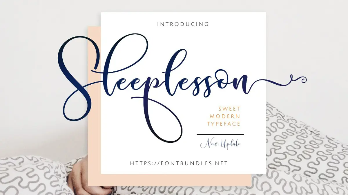
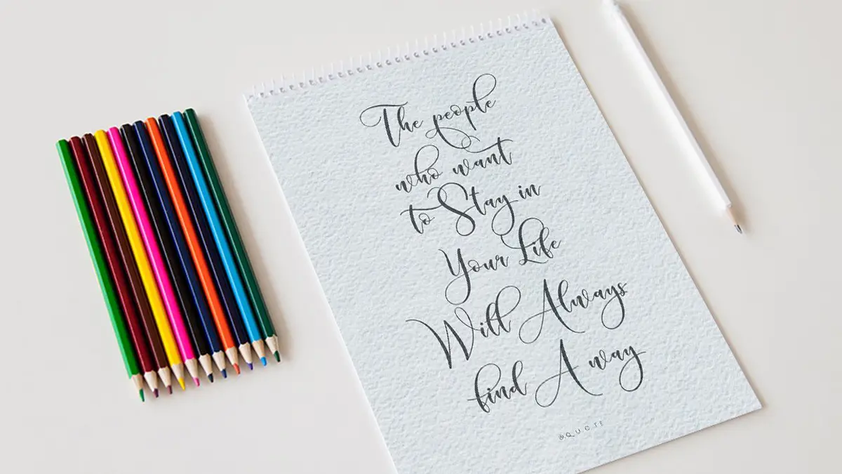
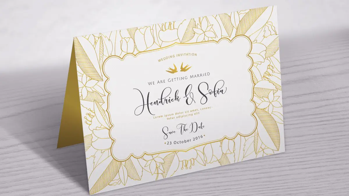
Modern script fonts started becoming popular around the early 2000s. These fonts are stylish, with flowing lines that mimic cursive handwriting. They’re great for adding a personal touch to your designs. One of my favorites is Sleeplesson Modern Script. It’s elegant and perfect for invitations, logos, and social media posts. Plus, it’s currently 50% off on FontBundles!
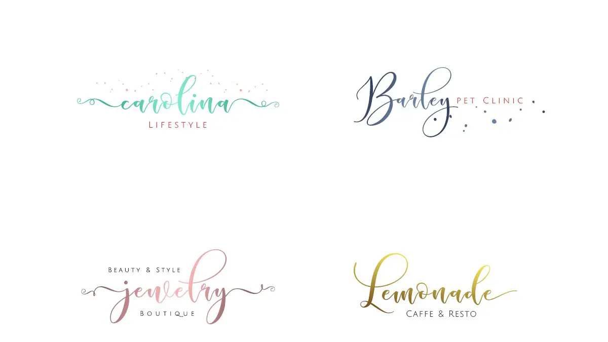
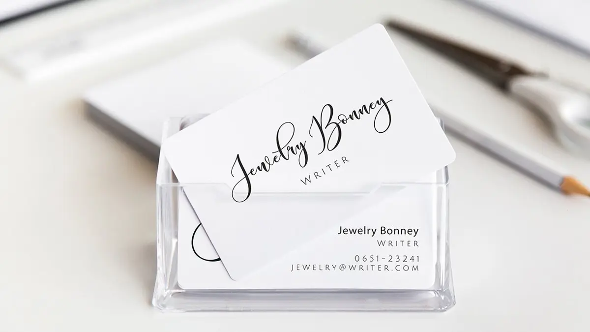
That’s it for today! Remember, choosing the right font can make a big difference in how your text looks and feels. Have fun exploring different typefaces and fonts, and don’t be afraid to get creative. And hey, if you need some cool fonts, check out Sleeplesson Modern Script. Also, don’t forget to visit my FiveCatsGraphic Shop on Etsy and explore the Premium content here on graphics-illustrations.com.
Stay creative and have fun creating!


