Top Logo Design Trends for Financial Services in 2025
Logos are more than just pretty symbols; they’re the face of a brand. And in financial services, where trust and credibility matter more than ever, a well-designed logo can make or break a company’s image. So, what’s hot in 2025? What design trends are shaping the future of financial branding? Let’s dive in and explore the styles that will define the next generation of finance logos.
Minimalist But Powerful
Gone are the days of overly complex, cluttered logos. In 2025, financial institutions are embracing minimalist yet bold designs. Simple typography, clean lines, and smart use of negative space create a modern, trustworthy, and timeless look. Think less is more – because in finance, clarity equals confidence.
Elegant Serif Fonts Are Making a Comeback
For years, sans-serif fonts ruled the financial world, giving brands a sleek, modern feel. But in 2025, we’re seeing a resurgence of elegant serif fonts. Why? Because they exude professionalism, tradition, and trust. These fonts add a touch of heritage while still feeling contemporary – perfect for financial firms wanting to blend classic values with a fresh image.
Abstract Symbols Over Literal Icons
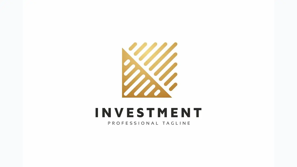
Money bags, dollar signs, and vault doors? So last decade. Financial brands are moving towards abstract, geometric symbols that evoke a sense of stability, innovation, and future-thinking. Abstract logos don’t scream “finance” at first glance, but they create strong brand recognition over time.
Sustainable and Earthy Color Palettes

Green isn’t just for money anymore – it’s for sustainability. As financial institutions emphasize ethical investing and eco-conscious initiatives, logos are reflecting this shift with earthy tones like deep greens, warm browns, and calming blues. These colors evoke stability, responsibility, and sustainability, aligning with the values modern consumers care about.
Gradient and Duotone Effects for Depth
Flat logos dominated for a while, but in 2025, we’re seeing a resurgence of gradients and duotones. These effects add depth and dynamism to logos without making them look overwhelming. Financial firms are using subtle gradient blends to give logos a futuristic, tech-forward feel – perfect for fintech startups and digital banking services.
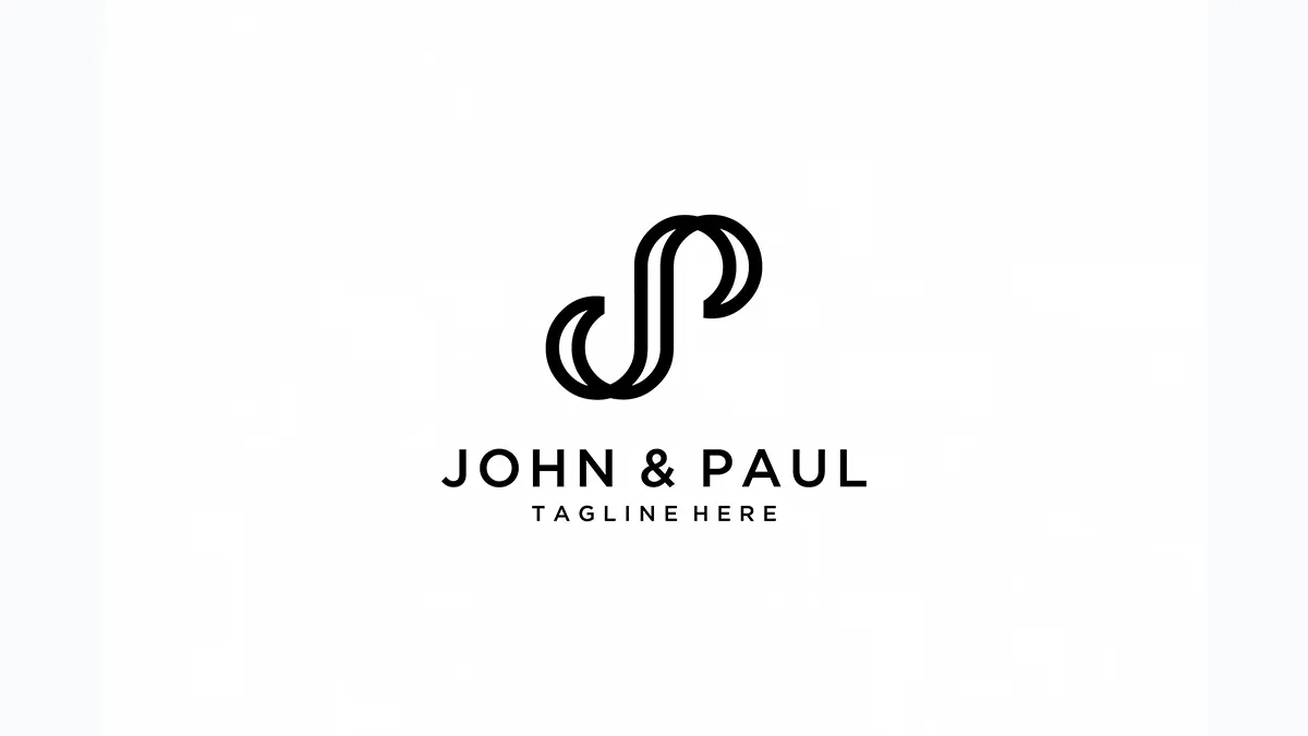
Custom Lettering for a Unique Identity

Want to stand out in a sea of similar-looking financial logos? Custom lettering is the way to go. In 2025, more brands are ditching generic fonts and investing in bespoke typography. This not only ensures uniqueness but also makes the logo feel handcrafted, premium, and highly recognizable.
Responsive Logo Design for Digital First Impressions
With more people interacting with financial brands online first, responsive logo design is a must. A single, static logo no longer works across different devices and platforms. Adaptive logos adjust for different screen sizes while maintaining brand consistency – whether it’s on a website, an app icon, or a smartwatch.
Hand-Drawn and Organic Elements

Finance may be all about numbers, but that doesn’t mean it has to look robotic. In 2025, brands are embracing hand-drawn elements to add a touch of authenticity and approachability. These can be in the form of subtle sketches, textured typography, or organic line art – giving brands a human feel.
Dynamic Logos for a Modern Edge
Why settle for one static logo when you can have multiple variations? Dynamic logos adapt their form based on where they appear – on websites, social media, or digital screens. These logos use motion graphics, color variations, and responsive elements to stay modern and engaging in a rapidly changing digital world.
Why Logo Design Trends Matter for Financial Services
Trust, credibility, and differentiation – these are the three pillars of a great financial logo. A dated or uninspiring logo can make a brand feel out of touch, while a sleek, modern design establishes authority and confidence.
Logos shape first impressions. Whether it’s a new fintech startup or a legacy bank rebranding for the digital age, staying updated with logo design trends ensures relevance and competitiveness.
How to Apply These Trends to Your Financial Brand
So, how can you use these trends for your own financial brand? Here’s how:
- Analyze your current logo: Does it look outdated? Could it be more adaptable for digital use?
- Embrace simplicity: Strip away unnecessary elements for a cleaner, bolder design.
- Choose the right typography: If you want a modern feel, go sans-serif. If you prefer a classic yet sophisticated look, try a serif font.
- Use color strategically: Green for sustainability, blue for trust, and gradients for a futuristic touch.
- Consider flexibility: Make sure your logo works across all digital and print platforms.
By incorporating these elements, you’ll future-proof your brand while making it look credible, innovative, and professional.
Frequently Asked Questions About Top Logo Design Trends for Financial Services in 2025
What are the top logo design trends for financial services in 2025?
Minimalism, serif fonts, abstract symbols, earthy color palettes, gradients, and custom lettering are among the biggest trends.
Why is logo design important for financial services?
A strong logo builds trust, credibility, and recognition. It helps financial institutions stand out in a competitive market.
What colors are trending in financial logo design?
Earthy tones like deep greens, warm browns, and calming blues reflect sustainability and trust.
Should financial brands use custom typography?
Yes! Custom lettering ensures uniqueness, making the brand memorable and professional.
How can I make my financial logo future-proof?
Focus on simplicity, adaptability, and a digital-first approach to ensure longevity and relevance.
Financial services may be all about numbers, but their logos? They tell a story. Whether it’s a sleek fintech startup or a 100-year-old bank rebranding for the future, the right logo builds trust, credibility, and recognition.
If your financial brand is due for a refresh, now’s the time to embrace these trends and create a logo that stands the test of time!