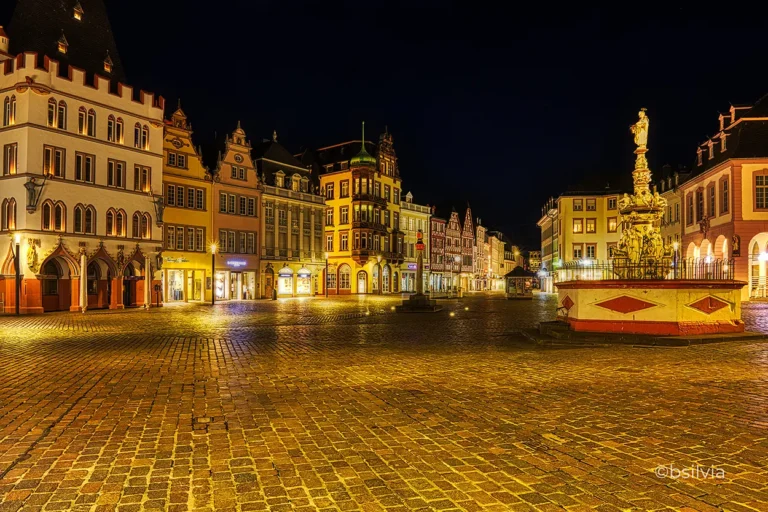
Let’s Talk About Gold.
Have you ever found yourself mesmerized by the shimmer of gold? Not just the jewelry-store kind, but the warm, inviting glow that feels timeless, elegant, and rich with history. If so, you’re not alone!
Gold has long been associated with luxury, power, and beauty, and today, it’s experiencing a major comeback in graphic design. Welcome to the Golden Era trend, where history meets modern creativity, and a little sparkle goes a long way.
The Gilded Age: When Everything Was Dipped in Gold
Before we talk about the Golden Era trend in design, let’s take a quick detour to the Gilded Age – a time when gold wasn’t just a color but a statement.
Coined by Mark Twain, the Gilded Age (1870s–1900s) was a period of:
- Wealth & Extravagance – Mansions, ballrooms, and opulent design flourished.
- Technological Advancement – Railroads, telegraphs, and electricity changed daily life.
- A Glittering Illusion – Despite the wealth, deep social inequalities remained hidden beneath the surface.
Fast forward to today, and while we no longer build golden train stations, we still crave the warmth and luxury that gold represents. In a digital world dominated by cold metallics and minimalist aesthetics, gold brings a touch of elegance and timelessness.

Golden Era Trend in Graphic Design: A Modern Renaissance
The Golden Era trend in graphic design is not just about adding gold paint to everything. Instead, it’s about using gold strategically to:
- Create warmth in digital and print design
- Enhance branding with a sense of prestige
- Balance modern minimalism with a classic touch
It’s a revival of timeless elegance, merging history with digital innovation. And trust me, the results are stunning.
Gold in Packaging: A Case Study in Elegance
Think about your favorite high-end products. What makes them stand out on store shelves?
Gold is often used in luxury packaging because it instantly signals:
- Quality & Prestige – Gold = premium. Simple as that.
- Attention to Detail – Even a small gold accent makes a brand look more refined.
- Timeless Appeal – Gold never goes out of style.
Example:
- Luxury skincare brands use gold foil for an upscale touch.
- Wine and champagne labels feature gold lettering to highlight tradition and elegance.
- Chocolate and confectionery packaging often incorporates gold to suggest indulgence.
Gold makes a product feel exclusive – and that’s exactly what great design should do.

Digital Gold: Bringing Warmth to Virtual Spaces
It’s not just physical design that’s embracing gold. Digital design is also experiencing a golden revolution:
- Web & UI Design: Websites are using gold gradients and metallic textures to add warmth to sleek modern layouts.
- Social Media Graphics: Influencers and brands are adopting gold accents in Instagram posts, story templates, and logos.
- NFT & Digital Art: Many digital artists are incorporating golden hues to create luxurious, futuristic aesthetics.
It’s a perfect blend of classic richness and modern minimalism.
Personal Experiment: Gilding Black and White Photography
For a personal project, I’ve been experimenting with a fusion of analog and digital art:
✨ Gilding black and white analog photos with gold leaf.
Imagine a timeless monochrome portrait, but with delicate golden details that catch the light. It’s an idea I’ve been sketching digitally, but I’d love to bring it into the real world.
Could this be the next big thing? Maybe. But one thing’s for sure – gold has the power to elevate any piece of art.

Why the Golden Era Trend Is Here to Stay
Some trends are fleeting, but gold has stood the test of time – from ancient civilizations to the digital age. Here’s why the Golden Era trend in graphic design will stick around:
- Gold bridges tradition and technology – It works equally well in classic and modern design.
- Gold enhances branding – It immediately elevates the look of a product or service.
- Gold creates emotional connections – It brings warmth, richness, and nostalgia in a world of cold minimalism.
As AI and digital design continue to evolve, gold provides a human, artistic touch that technology alone can’t replicate.
Ready to Add a Golden Touch?
The Golden Era trend in graphic design is more than just aesthetic appeal – it’s a statement. It reminds us that in a world of fast-paced innovation, we still crave beauty, warmth, and a connection to the past.
Whether you’re a:
- Designer looking to add elegance to your work
- Brand wanting to stand out in a crowded market
- Creative experimenting with new ideas
…gold might just be the secret ingredient you need.
So, what do you think? Are you ready to embrace the Golden Era trend? ✨
🚀 Let’s create something timeless!


